3 Best Practices to Improve Your Website Design
Designing a good website is a skill in its own right, but there are few basic design rules that can really help you to make the home of your online business look visually more appealing and become easier to navigate by your audience.
You'll end up with a balanced and cohesive look for your website as long as you stick to these simple but essential best practices and don't go down the rabbit hole of too many details and content:
#1:
Let Your Content Breathe
One of the biggest issues I see happening with websites (that makes my eyeballs hurt) is the nonexistent amount of breathing space left around different elements.
What I mean by this is the lack of white space aka negative space; the empty areas intentionally left around your elements with no content (and no, it doesn't necessarily have to be white).
You may feel nervous about leaving lots of empty space on your website, but in reality, it's a powerful method you can use to draw more attention to the areas you want to highlight and avoid a cluttered look.
The idea of negative space is to emphasise the main subject, whether it's an image, section of text or a call to action button, and draw the viewer's eye to it. The right amount of negative space makes your actual content become more effective and also easier on the eye to follow.
A good rule of thumb is that the larger the element is, the more negative space you should leave around it -- let it breathe.

#2:
Have a Consistent Theme
Yes, with your website too, consistency is key! Inconsistency causes confusion, confusion causes a lack of trust and lack of trust obviously won't help you convince people to buy from you.
You should have a clear theme that shows up through your brand colours, fonts, graphics and image style on every page of your website. These elements should be chosen based on the emotions you want your brand to reflect and that support the core message of your business.
Repeat the same colours for the same purposes throughout your pages (background, buttons, headlines, graphics), stay consistent with your fonts by using the same size, weight and style in the same places (headings, subheadings, main copy) and follow a unifying theme in your images (category, level of lighting, colour scheme, atmosphere).

#3:
Say More with Less
Another big visual issue many websites suffer from is the overloading amount of text on them. You should of course optimise your text for SEO but also make sure your site's user experience is enjoyable by keeping the amount of text to a minimum.
Big chunks of text aren't easy to read and tend to scare your readers away before they even get started. It's partially because there's a lack of that famous negative space again I already talked about, and the short attention spans people have these days aren't helping the case either.
The most visually effective websites get the core message across by using as little text as possible and taking advantage of graphics and images instead.
These easy tips can help you present your message in a more visually pleasing way:
-
section your content using different background colours
-
use max. 3 paragraphs in one section
-
use paragraphs of a maximum of 1-2 sentence
-
use headings and subheadings if necessary
-
use bullet points whenever possible
-
replace your text with graphics or images when possible
-
ask yourself if you can say the same thing in fewer words
By applying these three best practises you're on your way to creating a more user-friendly and effective website design that's also keeping with your brand. Your website is often the first place your potential customers land on, so make that first impression count!
With kindness,
![]()

Explore my free resources:
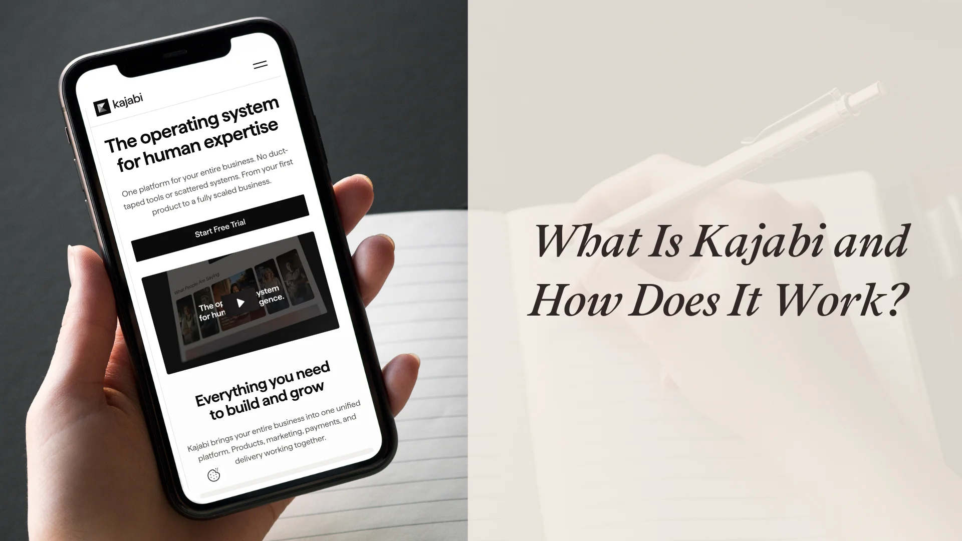
→ FREE 30-day Kajabi trial
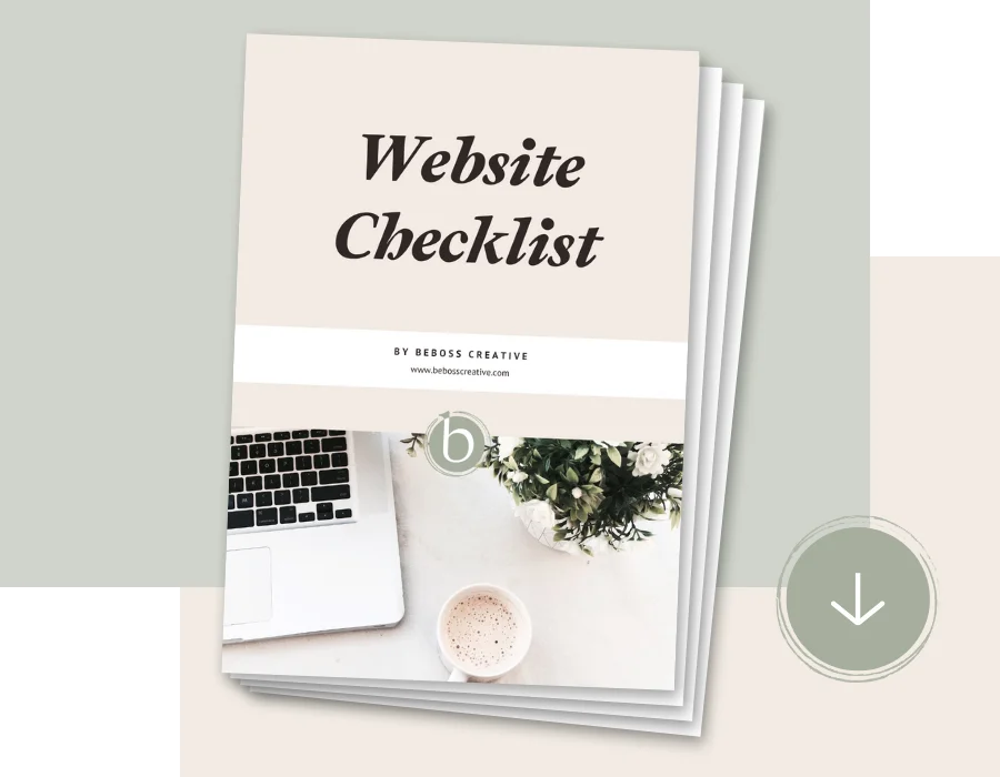
→ FREE Website Checklist
→ FREE Sales Page Guide
Or find out more about my:
→ Kajabi Template Shop
→ Brand & Web Design services